
From WordPress to Headless: Using Sanity.io To Deliver Engaging Content

Introduction
As a full stack software engineer on Virta’s Experience & Engagement squad, I help develop delightful experiences to engage patients in our diabetes reversal treatment. Exponential growth in Virta’s user base is driving one of the main challenges our squad faces: scaling the delivery of educational and inspirational content. In particular, with a huge diversity of patients with a variety of needs, we need to support a large content corpus for continuing education and mastery. The primary surface for patients to view this content is called Discover, which was formerly known as the Resource Center. Discover includes hundreds of self-published articles, webinars, recipes, and guides.
In the past, this content was primarily hosted and presented using a content management system (CMS) called Wordpress, with content being displayed in our mobile app using a WebView. This setup allowed our Clinical and Content Strategy teams to create and share new content without any work needed from Engineering after the initial setup. While this was a workable system for several years, in the last year several known feature limitations became more pressing as our growth accelerated.
Key Existing Limitations:
- Content data tied to presentation. While WordPress supports retrieving content via their REST API, the underlying data is represented as HTML. This gives us less flexibility with how our educational content is presented within the app. It also limits our ability to surface content outside of the WordPress-backed Resource Center in the app.
- Disjointed analytics. Because the content delivery and presentation were handled by Wordpress, it was challenging for us to measure user engagement with the same tools we use elsewhere in our app. The Google Analytics plugin on Wordpress provided some insights into impressions, but there was no way to tie these metrics to users in our system to fully understand their journeys.
- Limiting data model. The WordPress model of pages and posts worked really well for us for a lot of our content such as articles and recipes. However, it was challenging to extend it to support other kinds of content such as quizzes and sequenced learning modules.
Key Desired Improvements:
- Ability to segment content by user attributes. Segmenting by attributes allows us to build the same base app interface for similar use cases, but then differentiate the content. For example, this means users of our diabetes management offering will see different content from diabetes reversal. We also wanted the ability to be able to serve content in multiple languages.
- Unified analytics. Understanding how our users engage with content will allow us to build even more engaging experiences, such as a personalized recommendations engine.
- More delightful user experience. With better control of our content presentation, we can enforce a consistent design across every part of the patient journey, driving a more seamless and delightful experience.
Furthermore, our existing process for delivering personalized content is not scalable, as it is very time-intensive for coaches to manually find the best content for each patient. These desired improvements to our content management system would also enable us to use software to recommend personalized content. This creates a more engaging user experience, as algorithms can use data about known user preferences to make recommendations more accurately than a human ever could.
In an early-stage startup, it is often valuable to lean heavily on external services in the name of rapid iteration, and therefore we pursued a “buy’ strategy for software whenever viable. Giving up some measure of control or design to use an out-of-box solution is sometimes a necessary tradeoff for the ability to move quickly and not build all of it yourself. This was our situation when we first chose WordPress, which truly served us well for years. However, at some point, having more control becomes increasingly desirable. In our case, we now felt that control over our content data, delivery, and presentation would allow us to build richer experiences. It would also help us better understand how our users engage with the content, enabling our Applied AI team to use this data along with natural language processing algorithms to suggest personally relevant content. Thus, we decided to shift to a hybrid “buy+build” strategy, where we’d still leverage external software, but would look for options that had greater flexibility to integrate with self-built software to create the desired experience.
Once we’d aligned that Virta needed a new home for our content, we identified the following requirements:
- API: Content should be accessible via an API.
- Multilingual: The content platform must support multilingual content.
- Customization: The content platform should have out-of-box ability to create various types of content, such as articles, quizzes, and recipes.
Based on our tech stack and the above requirements, Sanity.io was chosen as the best solution.
Traditional vs Headless CMS
In a traditional CMS like Wordpress, everything from the back end, content management, and presentation layer is handled by the CMS. Sanity, on the other hand, is a headless CMS. In a headless CMS, content presentation (the head) is not included. The content is served via an API and thus should be presentation agnostic. Essentially, the platform handles the data, and we handle the presentation. While this model requires significant upfront investment in the front-end (head), it allows for flexibility in how the content is presented in-app, and also provides a platform to build more engaging experiences.
Schemas
Sanity allows us to define the structure of our content using JavaScript objects. In Sanity, every piece of user-facing content is called a Document. The structure of a document is defined in a schema, by composing simple fields such as Text, Image, Number, and Date, as well as more complex types like Objects. An object is a collection of fields that is used to define a custom type.
Using objects and documents, we can define a structure for our content. For example, a recipe consists of a few simple fields:
- Title
- Picture of the finished product
- Prep time
- Total time
- Ingredients & their quantities
- Instructions
We can further break down some of these fields for better reusability. In the example below, we define an ingredient document. A document is a single piece of content that can be reused. We can create an ingredient document for olive oil, with the title “Olive Oil”. Once created, we can reference this ingredient in multiple recipes.

This is a very simple document which consists of just one field - the name of the ingredient. In a recipe, we need to know the name of an ingredient as well as its quantity. A quantity consists of a number as well as a unit of measurement, such as “5 grams”. We can define that in the following object:
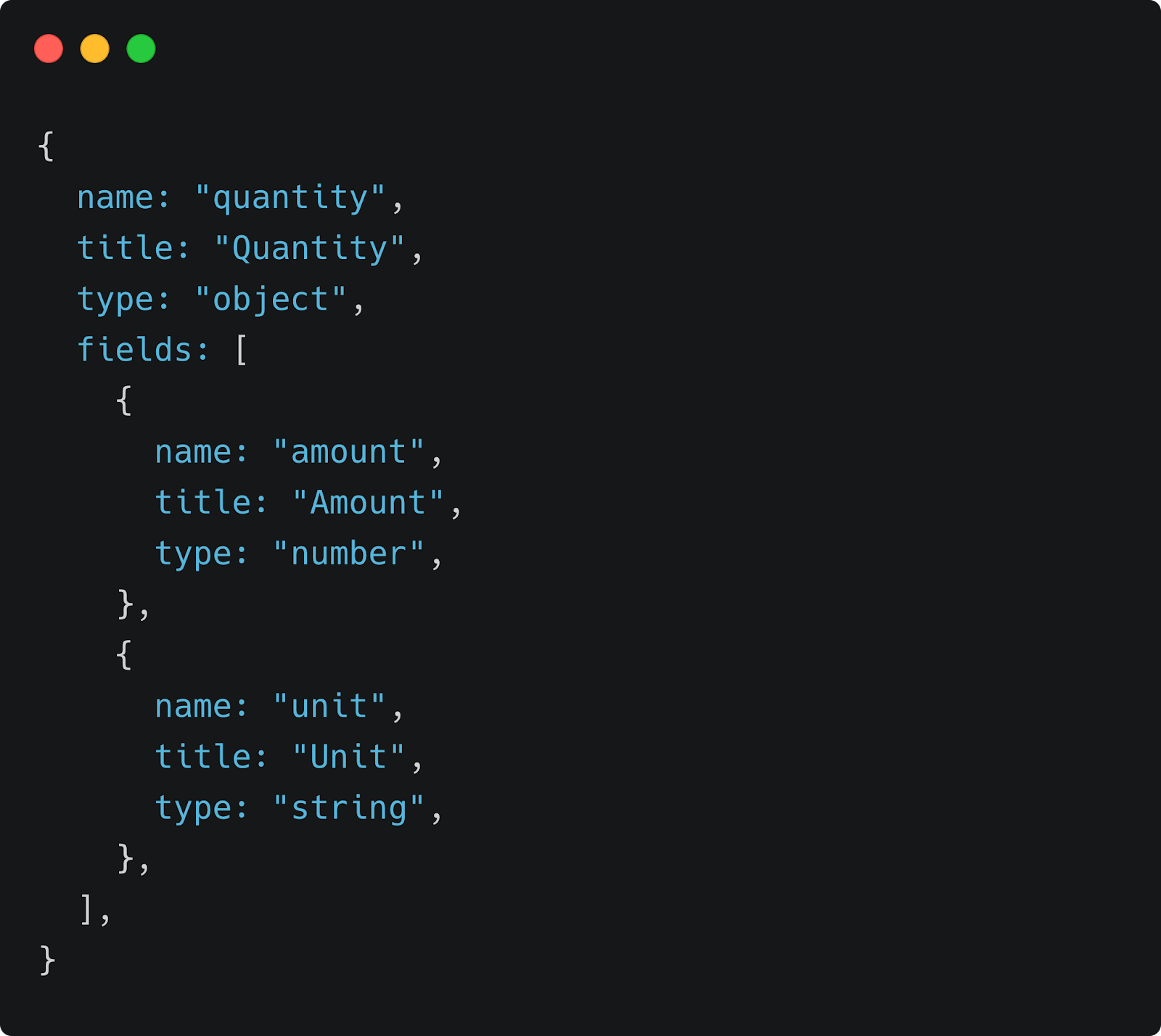
Note: Unlike a document, an object’s data is not reusable and cannot be referenced. Objects allow us to define complex types by grouping fields together. In our example, it may be useful to reuse “Olive oil” as an ingredient, but this is not necessary for a quantity like “2 tablespoons”.
Now we can combine the two, creating a recipeIngredient field. Here, we reference an ingredient document. This means that if the referenced ingredient gets updated, all documents that reference it will automatically reflect the change.
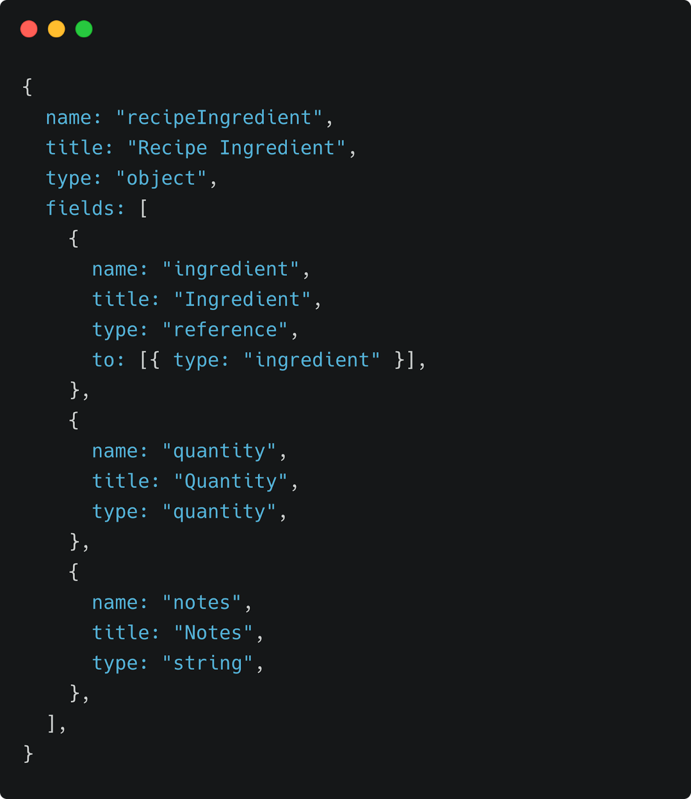
Note: As mentioned above, “ingredient” is a reference field to an ingredient document, whereas “quantity” is an object: a grouping of fields that describe something.
We can now use this recipeIngredient field in our recipe schema:
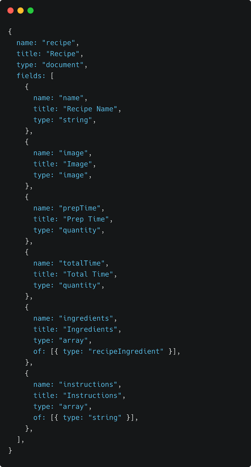
Note: the Quantity object is also being used to capture the recipe’s prep time and total time fields, as those can essentially be broken down into a number and a unit such as “30 minutes”.
Using out-of-the-box types such as strings, images, and arrays, as well as our own custom types, such as recipeIngredient, we have defined a template that we can now use for all recipes.
Perhaps the most interesting field type is the Block, which provides rich text capabilities modeled after Portable Text. This rich text is stored in the database as an array of JSON objects, and can be presented in a number of different ways such as HTML or React components.
Presenting the Content
At Virta, we have a component library written in React Native. Using Sanity’s block-content-to-react helpers, we can use the same React components we use throughout the app when presenting content. This provides a cohesive experience for our users, as the content looks and feels just like the rest of the app.

Segmenting the Content
One of the requirements of our new content platform was to segment content by certain user attributes. As Virta’s user base continues to grow and diversify, so does their needs. In 2021 we launched the Virta Clinic Expansion, which culminated in our first set of diabetes management users, who need different content than our diabetes reversal patients. For this reason, we had to come up with a scalable way to segment our content by these different user care plans (management or reversal). Sanity allows us to do this by simply extending our content models. By adding a care protocol field to the document model, we are able to easily filter on those properties in our queries. Going forward, we won’t have to do any engineering work to segment content for additional care protocols, as our content team simply has to categorize content appropriately.
Multi-language Architecture
Another requirement for our new platform was the ability to support content in multiple languages. We achieved this by using a Sanity plugin to organize translated documents. Using the plugin, we laid the groundwork for document-level translations. This means that for every English document that we have, we can create a translation in a different language that references the original document.
An alternate approach we considered was field-level translation, which as the name suggests, is where translations are implemented on the individual field level as opposed to the entire document. While this approach has more flexibility than document-level translation, it adds more complexity to the content presentation and doesn’t provide any functionality that our end users would benefit from.
With this architecture in place we can ensure systematic organization as we add multilingual content.
Search
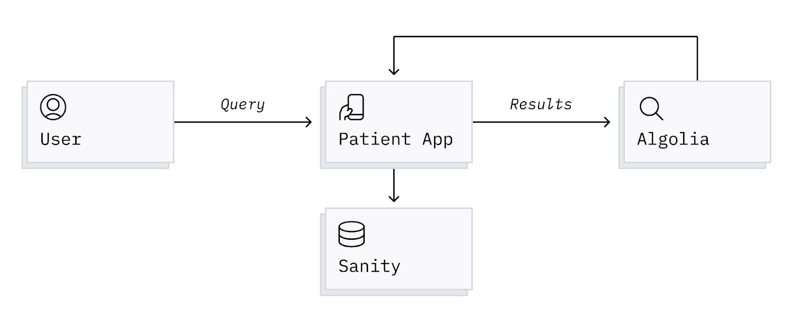
Search was implemented using Algolia. When changes are made to a document in Sanity, we can use the webhook feature to create, update, or delete the records of the content in Algolia. When a user searches for a query, the results are served directly from Algolia to minimize round trip time and latency. The Algolia records also contain all relevant fields that are needed to support segmentation of search results by user attributes, such as care protocol and preferred language. By using Algolia’s facet filters, we can set a user’s preferred language and care protocol in the search query to ensure that we don’t display irrelevant results. This prevents users from seeing irrelevant results and inevitably requiring unnecessary human support.
Impact
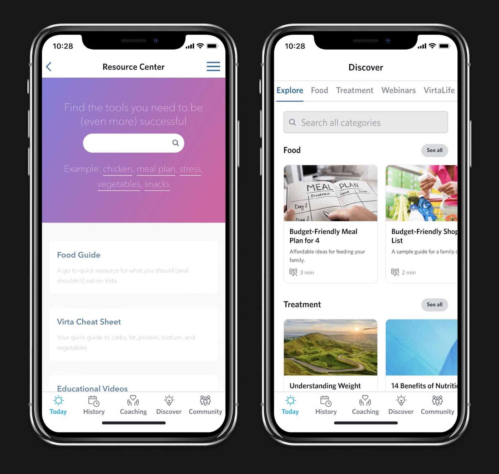
The image on the left is our old Resource Center. The image on the right is our new Discover experience, which is built using the same React components we use throughout the app. Content is presented via rows of carousels, which we can seamlessly supplement with personalized recommendations.
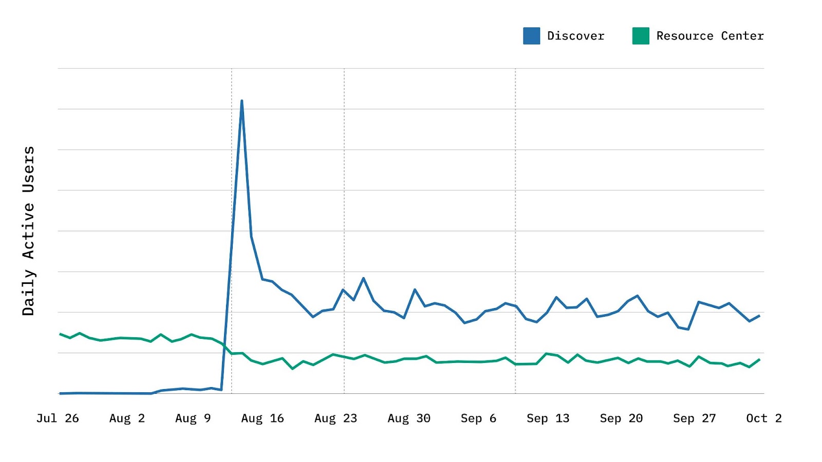
This graph shows daily usage of our Resource Center (green line) and the new Discover experience (blue line) after the Discover broad launch in August of 2021. It’s common to see a significant spike when you release a new feature and drive users to it using push notifications, but the real question is how usage compares after the novelty wears off. As you can see, long after our launch, the Discover feature was engaging 2x as many users as the Resource Center had been. For a squad that prioritizes user engagement, this was a quantitative success!
Conclusion
In just my first two years at Virta, I’ve seen over 5x growth in our patient population. As we continue to grow exponentially, I look forward to providing more engaging experiences that guide our users on their journey to better health. I’m excited to see what the future holds for our treatment, with features such as AI-driven content recommendations and personalized learning modules.
This blog is intended for informational purposes only and is not meant to be a substitute for professional medical advice, diagnosis, or treatment. Always seek the advice of your physician or other qualified health provider with any questions you may have regarding a medical condition or any advice relating to your health. View full disclaimer
Are you living with type 2 diabetes, prediabetes, or unwanted weight?


